Why do AI-generated pictures always contain typos? Take apart the model to
AI 测评室
May 4, 2026

You may have discovered that the pictures drawn by AI are getting better
You may have discovered: the pictures drawn by AI are getting better and better, but the words in the pictures are often wrong. This is not an accident - it is a structural problem.
A crazy scene
You use AI to generate a beautiful promotional poster. The composition is perfect, the color matching is advanced, and the light and shadow are natural. Then you take a closer look - "SUMMER SALE" is written as "SUMMER SAIE", or the word "Hui" in the Chinese title "Limited Time Special Offer" is missing a horizontal line.
You regenerated once. This time "SALE" is correct, but the date in the subtitle has become garbled.
You try again. The date is correct, but the character spacing is suddenly large and small, and the overall layout looks like a drunk.
This is not because your prompt words are not well written, nor is it because the model is too bad. This is a structural shortcoming of current AI image generation technology—and it’s not going away anytime soon.

This article will break down the problem, explain "why the words are always written incorrectly" from five levels, and then tell you why "letting AI rewrite it" is usually not the best solution.
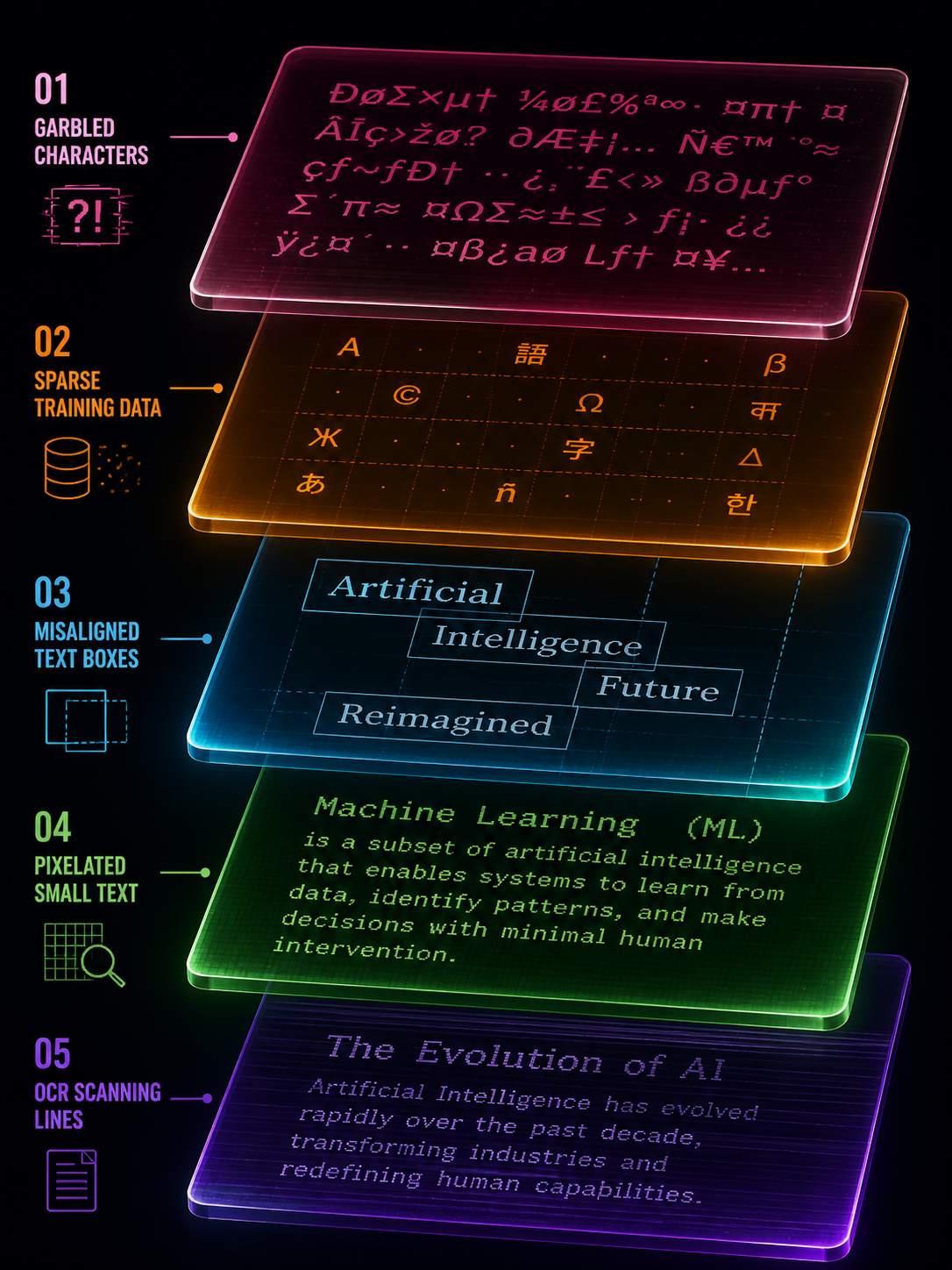
The first level of cause: the model does not "recognize" the word at all
Most people think that AI models "understand text first and then draw it". This is not the case.
Mainstream image generation models (Stable Diffusion, DALL-E, Flux, etc.) use BPE word segmentation - a coding method that cuts text into "word fragments". BPE is good at understanding semantics ("This is a poster"), but not good at precisely controlling glyphs ("This letter is an E, not an F").
What’s even more troublesome is that the text encoders in these models—whether CLIP or T5—are not designed to “draw characters accurately.” CLIP favors "concept alignment" (understanding the correspondence between pictures and text), and T5 favors "language understanding" (understanding the meaning of sentences). Neither is designed for "pixel-level text rendering".
For example: let a person with strong understanding but poor writing skills copy a piece of text on a canvas with his eyes closed. He roughly knows what he wants to write, but the strokes, spacing, and size of each word are all different. This is the basic state of the current model for processing text.
This means: No matter how you optimize the prompt words, the accuracy of the model's text control naturally has an upper limit. This upper limit cannot be exceeded by the "prompt word technique".
The second level of cause: the lack of "glyph pairs" in the training data
Even if the model is capable of accurately rendering text, it requires a large amount of "text-glyph" paired training data to learn. The problem is, such high-quality data are scarce.
There is indeed a lot of text in real-world images—street signs, packaging, posters, books—but the font annotation of this text is almost non-existent. The model knows "there are words in this picture", but it does not know "what font, what weight, and what spacing is used for this word".
The result is: the model can learn to "roughly draw the words", but it cannot learn to "precisely control the font style". This directly leads to font style drift - if you ask for sans-serif, it will give you an approximate serif; if you ask for the same thickness on the same line, it will give you a thicker or thinner one.
The situation in Chinese is even more serious. There are thousands of commonly used Chinese characters, and the stroke complexity is much higher than that of Latin letters, but Chinese text annotations in the training data are even scarcer. This explains why many models are "ok" in English but "frequently wrong" in Chinese.
The third layer of causes: layout control is too weak
A piece of text in a picture is not just "a few words", it involves a bunch of geometric relationships such as position, size, line spacing, character spacing, alignment, baseline, etc. Current models have poor control over these geometric relationships.
This is not obvious in simple scenarios - a big headline, a brand name, the model can usually handle it. But once it becomes multi-line text, multiple text boxes, and different levels of typesetting, problems arise:
- Words are sometimes far and sometimes close, and line spacing is inconsistent
- Left and right misalignment, baseline drift
- The relative position of multiple text boxes is wrong
- The quality of the text in the back row of long paragraphs is significantly reduced
The academic community refers to these collectively as "long text" and "multiple text boxes" problems, which are currently recognized difficulties. Research like EasyText and BizGen specifically focuses on "long text", "multiple text" and "irregular areas", which itself shows that the stability of these scenarios is far from being solved.
Practical Impact: If your figure only needs a one-line caption, AI can do the job. If your image has five or six levels of text (title, subtitle, time, place, selling point, call to action), and each level needs to be typed precisely—the AI’s failure rate rises dramatically.
The fourth layer of cause: latent space compression is not friendly to small characters
The diffusion model does not work directly in pixel space, but generates it in a compressed "latent space". This is very friendly to large objects (landscapes, people, products) - saving video memory, saving computing power, and high efficiency.
But for small print, latent space compression means the loss of high-frequency details. Text with thin strokes, hard edges, and extremely low error tolerance is prone to appear during the compression and restoration process:
- Blurred or broken strokes
- jagged edges
- "False details" appear after zooming in - strokes that look like words but are actually "imagined" by the model
This explains a common phenomenon: AI-generated large headlines are often good, but small text (price, ingredients, disclaimers) are often blurred or distorted. It's not that the model "doesn't want" to write small characters well, it's that the resolution of the latent space limits the extent to which it "can" write small characters well.
Logic of the solution: Correct the words first, then enlarge them. If you enlarge first and then correct the characters, the model will "brain-fill" more erroneous stroke details during the enlargement process, making it more difficult to repair.
The fifth layer of causes: identification and preprocessing can also trick you
Even if the words generated by AI look "almost right", there may be problems when you use an OCR tool to verify them. This is not the fault of the OCR tool, but the image preprocessing was not done well.
Tesseract official documentation clearly lists four things as key preprocessing for the success or failure of OCR: rescaling (scaling), binarization (binarization), denoising, and deskew (correction). PaddleOCR adds three additional switches: direction classification, text image correction, and text line direction classification.
In other words, the root cause of many "OCR recognition errors" is not the recognizer itself, but the geometry and preprocessing of the image. An image that is skewed by 2 degrees, a text area with insufficient contrast, a piece of text with too soft anti-aliasing - all can cause OCR to produce completely wrong results.
Practical suggestions: Before using OCR to verify AI-generated text, do these pre-processings: make sure the contrast in the text area is sufficient, the image is not significantly tilted, and the edges of the text are not excessively blurred. This is much more effective than switching to a larger OCR model.
The reality after superimposing five layers of causes
Stack the five layers together and you will understand why "AI writing" is so difficult:
- The model’s text encoder is not designed for precise glyphs
- Lack of high-quality glyph-font pairing training data
- Weak geometric control ability of multi-text layout
- Latent space compression is not friendly to high-frequency details of small characters.
- Improper image preprocessing will lead to errors in verification
These five-layer problems are not defects of a certain model, but structural limitations of the entire diffusion image generation paradigm. GPT Image 2 is much better at text rendering than its predecessor, but these underlying limitations have not disappeared—they have only been partially alleviated.
Is "let AI rewrite it once" useful?
Useful, but limited.
For short display terms (3-5 word titles, brand names), it is indeed possible to "hit" a correct version with regeneration. But this is essentially a game of probability—each generation is an independent draw, and convergence is not guaranteed.
For long texts, multiple text boxes, and complex layouts, regenerating will rarely improve the problem. Because the root cause is not "randomness", but the structural upper limit of the model's capabilities. You try again 10 times, and maybe 10 times you get it wrong in different places.
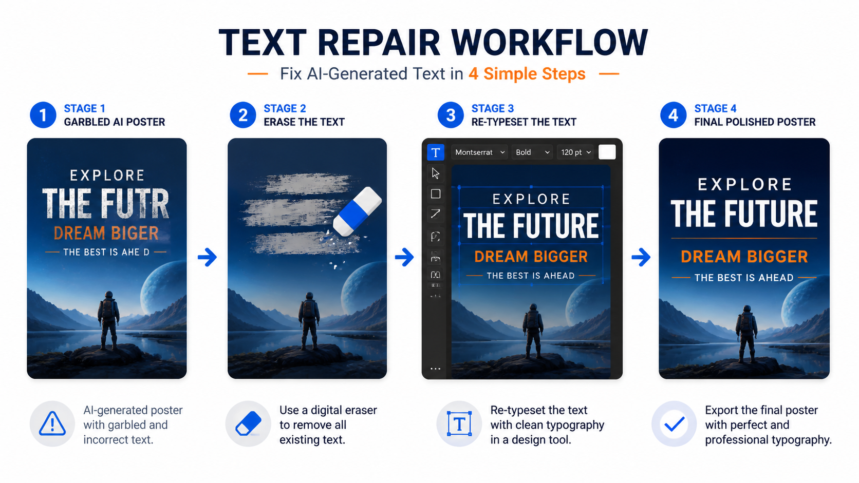
A more stable approach is to treat the text generated by AI as a "sketch" - it gives you a rough style, layout and atmosphere, but the text itself needs to enter a post-processing process of "erasure - recognition/proofreading - rearrangement - export".
This is not "AI is not good", but "AI is responsible for the parts it is good at (visual style), and people and tools are responsible for the parts AI is not good at (precise text)".
Risk levels in different scenarios
Not all text requires the same level of post-processing. According to risk level:
Low risk: Decorative text for poster titles, social media graphics. This type of text is more aesthetic, as long as it "looks right". AI straight out + visual inspection is usually sufficient. You can also try to use inpaint to correct short display words.
Medium risk: brand name, event name, date, price. This type of text requires "really right", but there are not many words. It is recommended to use OCR verification + manual review, and use local editing to repair errors.
High risk: ingredient lists, regulatory text, multilingual labels, infographic data. This type of text has extremely low error tolerance, and a single letter or number error may lead to legal problems. By default, it enters the "OCR extraction + vector rearrangement + item-by-item proofreading" process, and does not bet on AI getting it right in one go.
The judgment standard is very simple: Poster titles can be allowed to "look like they are arranged correctly"; labels and infographics must require "really arranged correctly".
One sentence summary
The errors in text generated by AI are not accidental, but the superposition of five-layer structural issues such as text encoding, training data, layout control, latent space compression and preprocessing. The most stable strategy is not to retry again and again, but to treat the AI text as a sketch and use the post-processing process of "erase-recognize-rearrange" to correct it.
Want to see the real difference in text rendering between different models? You can run several models using the same prompt word on gpt-image-2.live and compare the text accuracy - you will find that the gap is larger than you think.