How to Write GPT Image 2 Prompts That Produce Production-Ready Images
GPT Image 2 Team
May 8, 2026
Learn how to write better GPT Image 2 prompts for posters, product visuals, UI mockups, infographics, and consistent creative workflows.
A good GPT Image 2 prompt is not just a sentence. It is a compact creative brief.
If you only write "make a cool poster" or "generate a product image," the model has to guess the subject, layout, background, lighting, typography, and final use case. Sometimes that works. But if you want images that are useful for marketing, ecommerce, UI mockups, social media, or brand content, you need a more structured way to prompt.
That is where GPT Image 2 becomes powerful: it can follow detailed visual direction, handle text-heavy layouts, preserve style intent, and create images that feel closer to finished design assets.
1. Start with the Asset Type
The first mistake many users make is describing the image subject before defining the asset type.
A weak prompt might say:
Create a futuristic VR headset with blue lighting.This gives GPT Image 2 a subject, but not a format. A stronger prompt starts like this:
Create a high-tech product poster for a futuristic VR headset.Now the model knows the output should look like a designed poster, not just a standalone object render.
Common asset types include product posters, ecommerce product images, social media ads, UI mockups, infographics, educational diagrams, brand visuals, character sheets, cinematic illustrations, and storyboard frames. The asset type controls the layout, visual density, typography, and composition. Before writing details, decide what the image is supposed to be used for.
2. Define the Subject Clearly
After choosing the format, define the subject with enough detail.
Weak:
A pair of sneakers.Better:
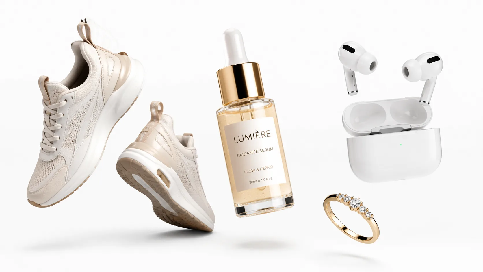
A pair of white running sneakers with lightweight mesh fabric, sculpted foam soles, reflective silver accents, and a premium studio product photography look.The stronger version gives GPT Image 2 more stable visual anchors: product type, material, color, shape, surface details, lighting style, and intended quality level. For ecommerce, product visuals, and brand images, this matters. The more concrete the subject is, the less the model has to invent.
3. Control the Layout Instead of Hoping for One
If you want a usable design, describe the layout.
A prompt like this is too open:
Create an infographic about AI image generation.A better prompt defines the structure:
Create a vertical infographic about AI image generation. Use a clear header at the top, four stacked sections in the middle, simple icons beside each section, and a short call-to-action block at the bottom.Useful layout instructions include vertical poster, square social media card, three-column comparison, 2x2 grid, hero image with headline, centered product with side callouts, top header and bottom CTA, dashboard-style UI layout, and step-by-step flow diagram. GPT Image 2 works better when it knows where visual elements should go.
4. Separate Text Areas from Visual Areas
GPT Image 2 is especially useful for visuals that include text, but text needs to be handled deliberately.
Instead of writing:
Make a poster with some marketing text.Write:
Create a product poster with these text areas:
Headline: "Create Better Images Faster"
Subheadline: "AI image generation and editing for production teams"
Button text: "Start Creating"
Small footer text: "Built for marketers, designers, and content teams"
This gives the model a clearer hierarchy. For text-heavy designs, define the headline, subheadline, labels, captions, button text, footer text, callout text, and section titles. Also tell GPT Image 2 what matters most:
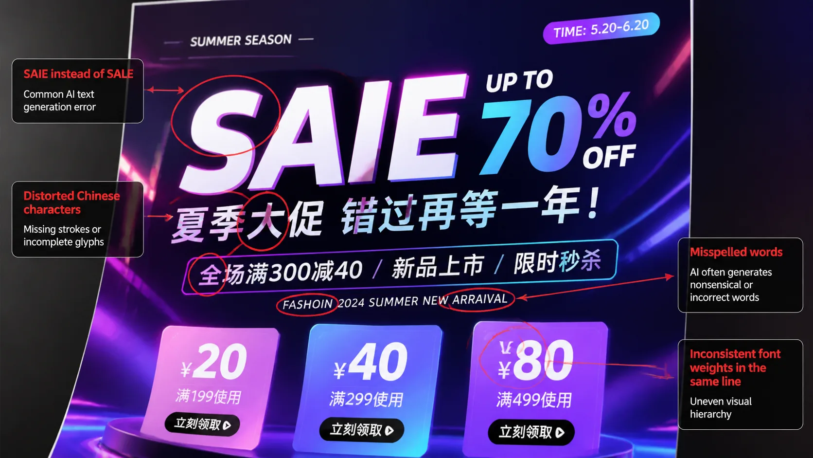
Keep all text sharp, readable, correctly spelled, and aligned with the layout.This is especially important for posters, infographics, UI mockups, product cards, and multilingual visuals.
5. Add Style, Lighting, and Mood
Once the structure is clear, add the visual style. Style instructions can include clean high-tech 3D render, editorial studio photography, premium ecommerce lighting, soft cinematic portrait, watercolor illustration, anime key visual, minimal SaaS interface, luxury fashion campaign, playful social media ad, or futuristic dashboard UI.
Lighting and mood also matter:
Use soft studio lighting, subtle shadows, clean reflections, and a premium commercial photography style.or:
Use dramatic cinematic lighting, high contrast, motion energy, and a dynamic low-angle perspective.Style should support the asset type. A product page image should feel clear and commercial. A concept art image can be more expressive. A UI mockup should be clean and legible.
6. Use Constraints to Avoid Common Failures
A good GPT Image 2 prompt should also say what not to do. Helpful constraints include:
Do not add extra text.
Do not change the product shape.
Keep the logo area clean.
Keep the background simple.
Avoid distorted letters.
Avoid duplicated objects.
Keep the composition balanced.
Make the final image look like a finished commercial asset.
Constraints are especially useful when the image has a practical purpose. If the output is for marketing, ecommerce, or a website, you usually want less randomness and more control.
7. Reuse Prompt Templates Instead of Starting Over
The best GPT Image 2 workflow is template-based. Here is a simple reusable structure:
Create a [asset type] for [subject].

Visual style:
[style, lighting, mood]

Layout:
[composition, sections, text placement]

Text:
Headline: [headline]
Subheadline: [subheadline]
CTA: [call to action]

Details:
[product details, character details, background details]

Constraints:
[readable text, clean layout, no extra text, consistent style]
You can reuse this structure for product posters, ad creatives, social media images, blog hero images, app UI mockups, landing page visuals, infographics, and educational cards. The template keeps the prompt consistent while allowing you to change the subject, format, and message.
8. Example Prompt: Product Poster
Here is a practical GPT Image 2 prompt you can adapt:
Create a premium ecommerce product poster for a modern wireless headphone.

Visual style:
Clean studio product photography, soft shadows, glossy highlights, dark navy background, premium technology brand feeling.

Layout:
Place the headphone in the center. Add three small feature callouts around it with thin connector lines. Put the headline at the top and a call-to-action block at the bottom.

Text:
Headline: "Immersive Sound. All Day Comfort."
Callout 1: "40-hour battery"
Callout 2: "Adaptive noise cancellation"
Callout 3: "Ultra-light fit"
CTA: "Shop the new release"

Constraints:
Keep all text sharp and readable. Do not add extra words. Keep the product shape realistic. Make the final image look like a finished ecommerce campaign asset.
This prompt works because it gives GPT Image 2 a clear asset type, a specific product, a visual style, a layout, exact text, and quality constraints. That is much stronger than asking for a "cool headphone image."
9. Example Prompt: Infographic
Create a vertical infographic explaining the workflow for AI image generation.

Visual style:
Clean modern design, light background, simple icons, soft blue and green accent colors.

Layout:
Use a top title area, four numbered steps in the center, and a short summary block at the bottom.

Text:
Title: "AI Image Generation Workflow"
Step 1: "Write the prompt"
Step 2: "Choose the format"
Step 3: "Generate variations"
Step 4: "Edit and export"
Bottom text: "Turn ideas into production-ready visuals faster."

Constraints:
Keep the layout readable. Make all text clear and correctly spelled. Use consistent icon style. Do not add extra sections.
This kind of prompt is useful for blog images, landing pages, tutorials, onboarding visuals, and social media education content.
10. Turn GPT Image 2 into a Visual Workflow
GPT Image 2 is most useful when you treat it as a workflow tool, not a random image generator. A practical workflow looks like this:
- Decide the asset type.
- Define the subject.
- Choose the layout.
- Write exact text blocks.
- Add style and lighting.
- Add constraints.
- Generate the first version.
- Refine the prompt based on the result.
- Save the final prompt as a reusable template.
This approach makes your results more predictable. It also helps teams create consistent visuals across campaigns, product pages, blog posts, and social channels.
Conclusion
Better GPT Image 2 prompts are not longer for the sake of being longer. They are clearer.
If you want better images, give the model a real creative brief: what the asset is, what the subject is, how the layout should work, what text should appear, what style it should follow, and what mistakes it should avoid.
That is how GPT Image 2 moves from simple image generation to production-ready visual creation.